3 products

mixer, blender, food processor

I hope these aren’t going to be boring choices… My plan is to integrate a shared motor among all three devices. I’d also like to take the approach of improving cleanability and usability over conventional forms.

Time to get crackalackin’…

It slices! It dices! It Juliennes fries!

Today marked the beginning of our new project–the kitchen appliance family project. I’ve seen other students do this project for two years, and I’ve been looking forward to it. I just want to do a good job with it. That said, I feel a little rushed to figure out which three appliances I want to design. I want to have a meaningful connection between the appliances because I feel like that’s an inherent part of being a “family.” I’ve thought about including some sort of shared element among the three, maybe a heating element or a motor. Is this really innovative, though? I’d like to do something unique and interesting with this project, so I don’t want to do something that’s been done a million times over. On the other hand, I want it to be useful and desirable, too. My personal philosophy about kitchen appliances is that no product should do only one thing. Devices that do this, such as toasters, are kind of a waste of space. A toaster oven is much more versatile, and to me, that makes it a better product. If you’re going to buy a piece of equipment to live forever on your kitchen counter, it better be well worth the space it takes up. That being said, there are some times when you may want to use two (or three) machines at the same time. How can I choose three appliances that wouldn’t overlap? Or better yet, how can I allow the appliances to overlap without inconveniencing the user? Most urgently, what are three appliances that are worth improving?

I can’t say I didn’t suspect it already…

Now, I don’t want to get off on a rant here, but in all honesty, today’s talk didn’t surprise me at all. I almost feel like I’d even been expecting it to happen at some point. I’m a paranoid person, so I’ve been looking at Coroflot portfolios and comparing myself for some time now. It makes me really depressed. I always feel like the stuff I have just can’t compete with that. Then, after a while, I get realistic–I make A’s in all my classes, so I must not be that bad, right? It doesn’t mean too much if I’m good compared to my classmates but only mediocre compared to my peers from other schools. It’s also not so surprising that our ID program is less than stellar. Each year that I’ve been in the program, at least one good professor has left…leaving more mediocre professors to take over their classes. I feel like this is the real problem that all of us have now. It’s not the case that other schools just attract more motivated and talented students–none of us came to Georgia Tech expecting it to be easy. It seems more likely that somewhere along the lines, we’re not being educated in a meaningful way. What I mean to say is that we’ve been allowed to get by with sub-par work, and then then standards are shifted down so that sub-par becomes acceptable work. I hope this is all making sense. In the past, I feel like we’ve been missing out on what the real design process is like. We were given strict deliverables–“each student must have 3 study models.” And when we bring the study models, we’re thanked for actually doing the work that was assigned rather than an honest critique, maybe something like, “you used an inappropriate material for the form you’re intending” or “are you really satisfied with the form of any of your models?” The last two statements are exactly what we’ve been missing. Maybe I should keep it more personal–it’s exactly what I’ve been missing. So we continue doing bad work because no one has wanted to expend the effort to tell us it’s bad and how to make it better.

That’s what I’m looking for in this semester. I want real feedback! In the past three semesters, I haven’t gotten descriptive feedback about my work at the end of a project, sometimes (only sometimes), I get back a rubric with the grade broken down into various components. Most of the time, it’s just a number posted on T-Square. How are we supposed to improve if that’s all we get? I want to know what I could improve. Today, that was really useful information–we all neglected to research and describe how our forms might actually be made. Honestly, I don’t even know where to begin finding that information. How do we research that? I tried to find wall-thickness information about bone china a few weeks ago, but nothing came up, so I just abandoned it. Today someone pointed out that the thickness of the handle and the thinness of the cup may not work out. Since I hadn’t done any significant research, I had nothing to say. As far as I know, he’s right–it won’t work. Going forward, I want to be able to know every single thing about my designs. If someone has a question, I need to have an answer. Be it questions about form development, modeling, manufacturing concerns, or technical specs, I should know it. That means I’m going to need to do more work. I did a lot of work on this project. Now I know the process a little better, so I’m prepared to do even more work next time. After all, I do need some good portfolio pieces. I would like to get a job some day.
Of course, that’s just my opininon; I could be wrong.

Quotes courtesy of Dennis Miller

whatcha think?

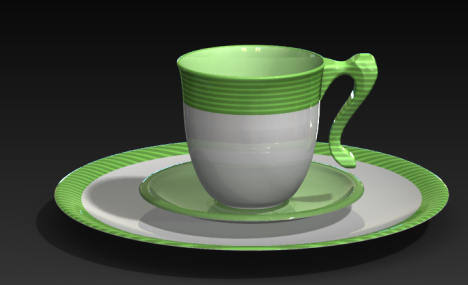
green_stripes-assembly

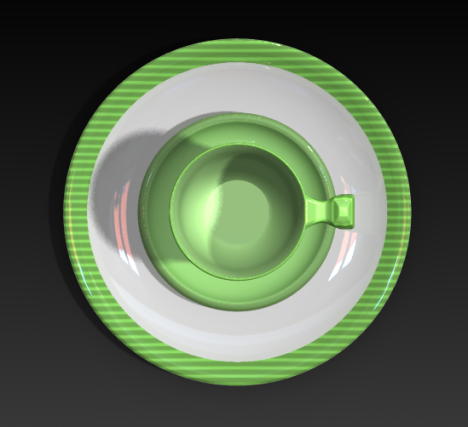
green_stripes-top1

Comments?

I need another 3 day weekend…

Seriously, I feel like I’ve been wading knee-deep in schoolwork ever since the semester started. I would really like some free time…

I thought the workshops on presentation and layout were pretty interesting, but the typography one was kind of stupid. It’s sad because I feel like I have a lot to learn about typography–I just already knew all the stuff that was covered today. And, just to be petty, I think I could have learned a lot more if the professor teaching it could have gotten out more than 4 words per minute. It really frustrates me when people talk slowly.

Over the next few days, I have to develop 3 graphic treatments for my dinnerware set. Hum… I’m not too sure where to start.
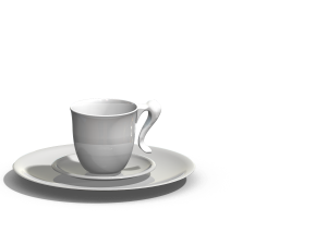
assembly
Suggestions?

where to go from here

So, the overwhelming sentiment (meaning about a dozen people wrote this verbatim) from the comments on my work today was that the handle looks more elegant than casual…because it looks like a ponytail.
I have two problems with this.

First, casual and elegant are not antonyms. “Fancy” and “formal” would certainly be the opposite of casual, but I think “elegant” applies to many different types of things. Oftentimes, something is elegant because of its simplicity. After all, shouldn’t everyone’s form be elegant? Isn’t this the quality which leads people to buy products? I guess what I’m saying is that I think “elegant” doesn’t need to be one of my 3 words for my design to be elegant. That being said, I think the glossy white finish on my renderings could have been one reason why people perceived my work as being “more elegant than casual.” I’ll have to keep that in mind with my graphical treatment.

Second, isn’t a ponytail casual? Let’s look at someone who would most certainly be described as elegant–an actress attending the Oscars. Has there ever been an actress seen sporting a ponytail to such a formal event? I’d say a ponytail is more of an everyday sort of thing. Someone correct me if I’m wrong, but I thought these comments just didn’t make sense.

What I’m most taking away from the comments is that I should include my definitions for my 3 words with my final presentation. This will help people understand more where I’m coming from. Also, I need to make sure the graphical treatment isn’t “fancy” or “formal.” I don’t want it to look clunky, but it should help sell the word “casual” a little better.

Seacrest out.

it’s been a good day…

I feel really happy about the way things worked out today. I spent most of my studio time down in the shop, using the lathe to make my plate and saucer and hoping that they came out right. I’d done some sketches initially to relate the plate and saucer to the cup, but this was the first time I was going to try and model them. Lucky me, it turned out well. Turning the plate was a little difficult because it was 10.5″ in diameter, and only .75″ thick. However, the saucer was the same thickness but only 6″ in diameter, and it came out looking great. I’ll probably take a Dremel to the plate a bit later to get it thinner. Otherwise, I’m quite pleased about how my set turned out. It fits together well as a family, and I think it captures the essence of casual, gentle, and compact. Now for graphics…

off to a good start

First of all, the title of this post is slightly misleading. I completely forgot to blog on Monday, so the blogging thing isn’t off to a good start. However, lots of other things are. I feel like this is going to be one of my best semesters in studio. I just feel driven and motivated, investigative and experimental…lots of new territory. In the past, I’ve tried to stay well within my comfort zone, drawing my tiny little sketches in my sketchbook, only making sketch models if I was specifically assigned to make them. This semester, I feel much more like the process is sinking in. You really can’t cheat the design process. You’ve got to sketch and model, and there needs to be a dialogue between them. Otherwise, your final product looks bad…period. When David was talking to us in the shop today, he said something that I felt was relevant to my work in the past. If you don’t know exactly what you’re doing, all the design decisions you’re making–every last detail–then you end up with a model that doesn’t look quite right, and your lack of enthusiasm for it shows in your presentation. I think this could be exactly my problem. In the past, I’ve tried to cheat the design process. Now, I’m resolved to do better. I’ve got myself a ream of 11×17 paper so I can do big sketches that actually communicate something. I bought an entire sheet of 2″ pink foam so I can make all the sketch models I want to. I’ve moved all my supplies into studio so that I do my work there, in the presence of other students who can help me when I get stuck. I’m calling it an experiment. If my work doesn’t get better this semester, I’ll throw in the towel–maybe I can’t be a great designer after all. However, I’m betting that this will be my best semester yet.

inspiration

So, I realize it would be useful to post some pictures of my work, but it’s all the way in studio, and I’m not going back right now. That said, I’ll post some pictures soon. Hopefully I’ll have some really photo-worthy stuff by then.

In the meantime, here are a few things that inspired my form on the detached-handle teacup. I was struggling with how I could make the handle seem to fit with the cup, rather than looking like two separate forms forced to sit together.
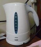
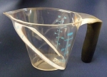
I looked at my Braun water kettle and an OXO measuring cup. These both have the same kind of handle I want for the teacup, but the forms are coherent. They also have a flare around the top edge, and I think this is the part I’ve been missing. Just a little flare-out at the top helps to balance out the visual weight of the handle on the other side. I think it did the trick!

doubt

I have a bad habit of getting discouraged in the middle of the design process. I just feel like I’m not capable of making attractive forms. My designs always seem to look utilitarian and “boring,” and I don’t really know where to go from there. Some people seem to have a knack for it. I’m more the type of person who practices and hones a skill rather than just having innate talent. As far as I know, there isn’t really a methodological way to construct interesting and attractive forms. Suggestions? For me, feeling like my design just doesn’t look right can really kill my interest in the project. If I’ve worked for a few weeks on developing an exciting concept only to have my final design look as though it’s a first attempt, I get so frustrated that I have a hard time following through to the end. Ultimately, I think it hurts my portfolio. It’s hard to communicate an exciting idea without exciting visuals. I feel like I’m a capable designer in many ways–I love working with computers, and I feel like my technical skills are pretty good. I can sketch reasonably well (after a few years of practice), and I think I can usually manage to solve problems really well through my design. It just doesn’t look that great. So, how do I solve this problem? How can I create more attractive forms? How can I carry my inspiration all the way to the end of a project? How do I document and describe these projects in a meaningful way? Will I be able to make it as a designer?

On a different note, I’m really looking forward to learning how to use more of the shop tools. Currently, I only really feel comfortable using the lathe, bandsaw, sanders, and drill press. I’ve never used the milling machine, and I’m slightly terrified of the tablesaw… I’m slightly terrified of all the machines, actually. I think that’s just because I haven’t had much practice with them. Usually, when I ask about how to do something, someone else just ends up doing it for me because it’s faster to do it for me than to explain it. I feel like I learned a lot this morning, even. I didn’t realize that you could use pink foam on the drill press and power sanders. Those are definitely time savers, and they allow more accurate forms, too. It’s also nice to have an instructor who actually wants to teach us these things…